The Product
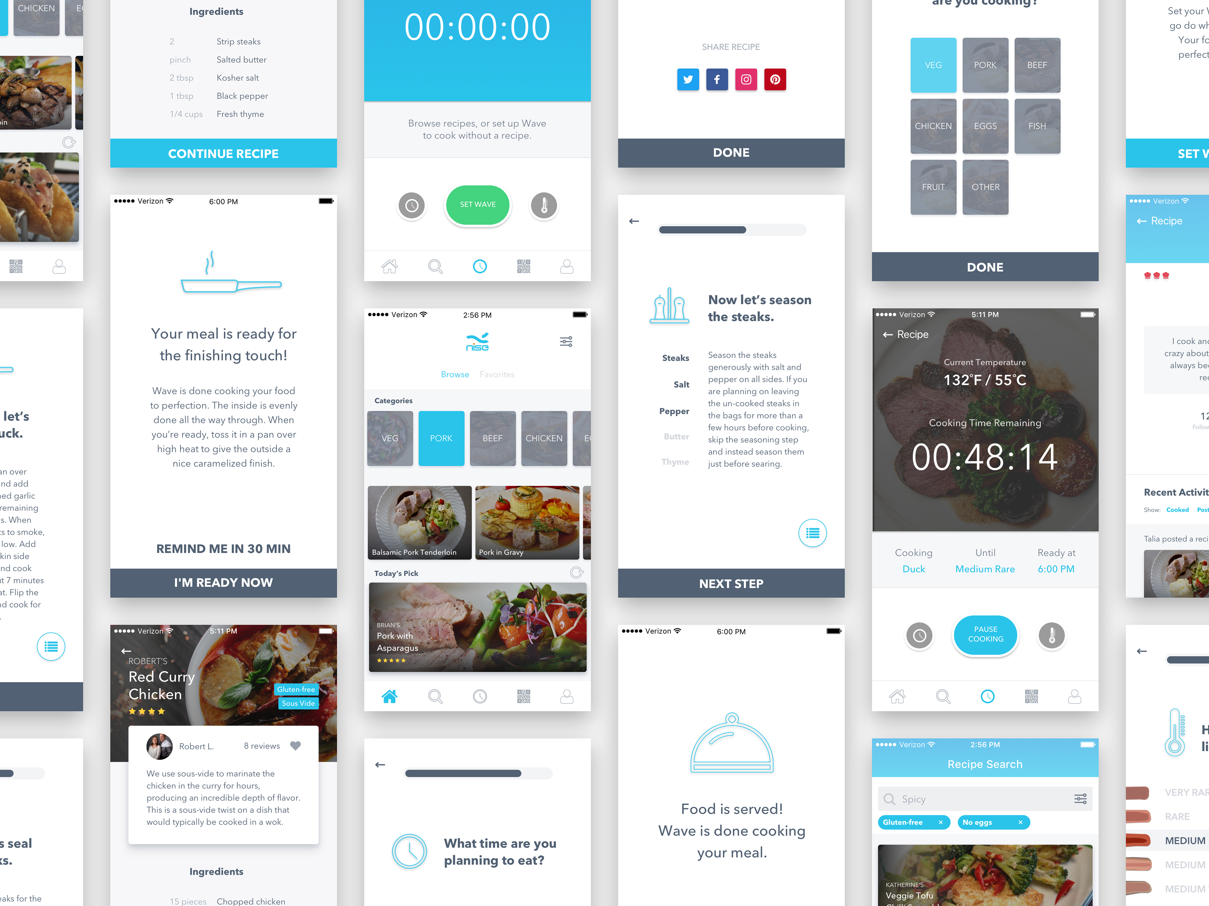
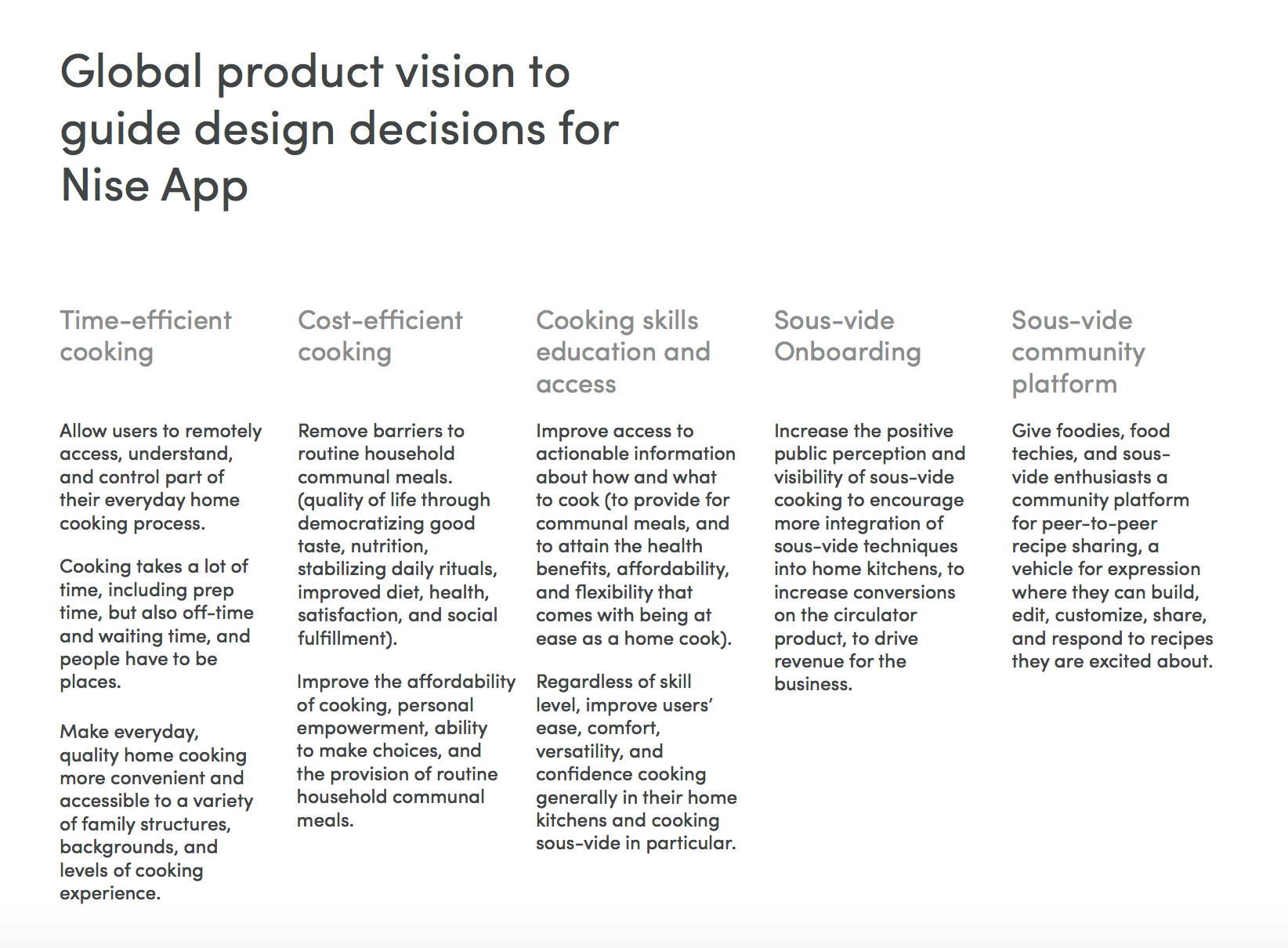
The Nise App is a mobile recipe platform for sous-vide home cooking. It serves as the companion to the Wave, a wifi-enabled sous-vide appliance for home kitchens.
My Role: UX & Visual Design
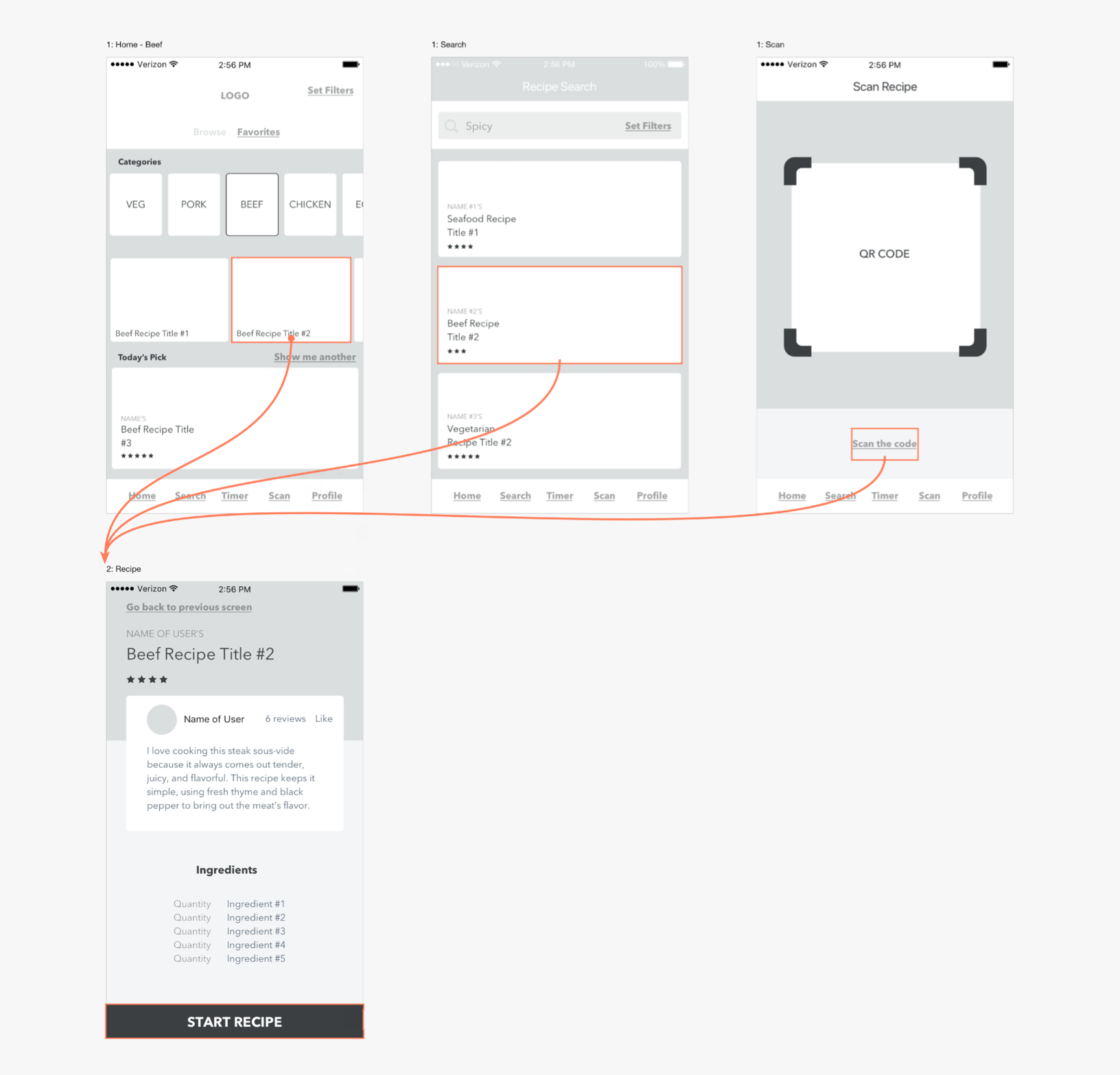
As the mobile product designer at Nise Tech, it was my responsibility to fully define and communicate the user experience of the app from the ground up, from early stage UX problem-solving and product/feature definition, to developing a model for interacting with the app and implementing these solutions through a consistent, branded visual design language across several different user flows: search, navigation, cooking with recipes, building and editing recipes, and cooking with the Wave appliance remotely on mobile.


Problems and Solutions
Different ways of controlling the circulator
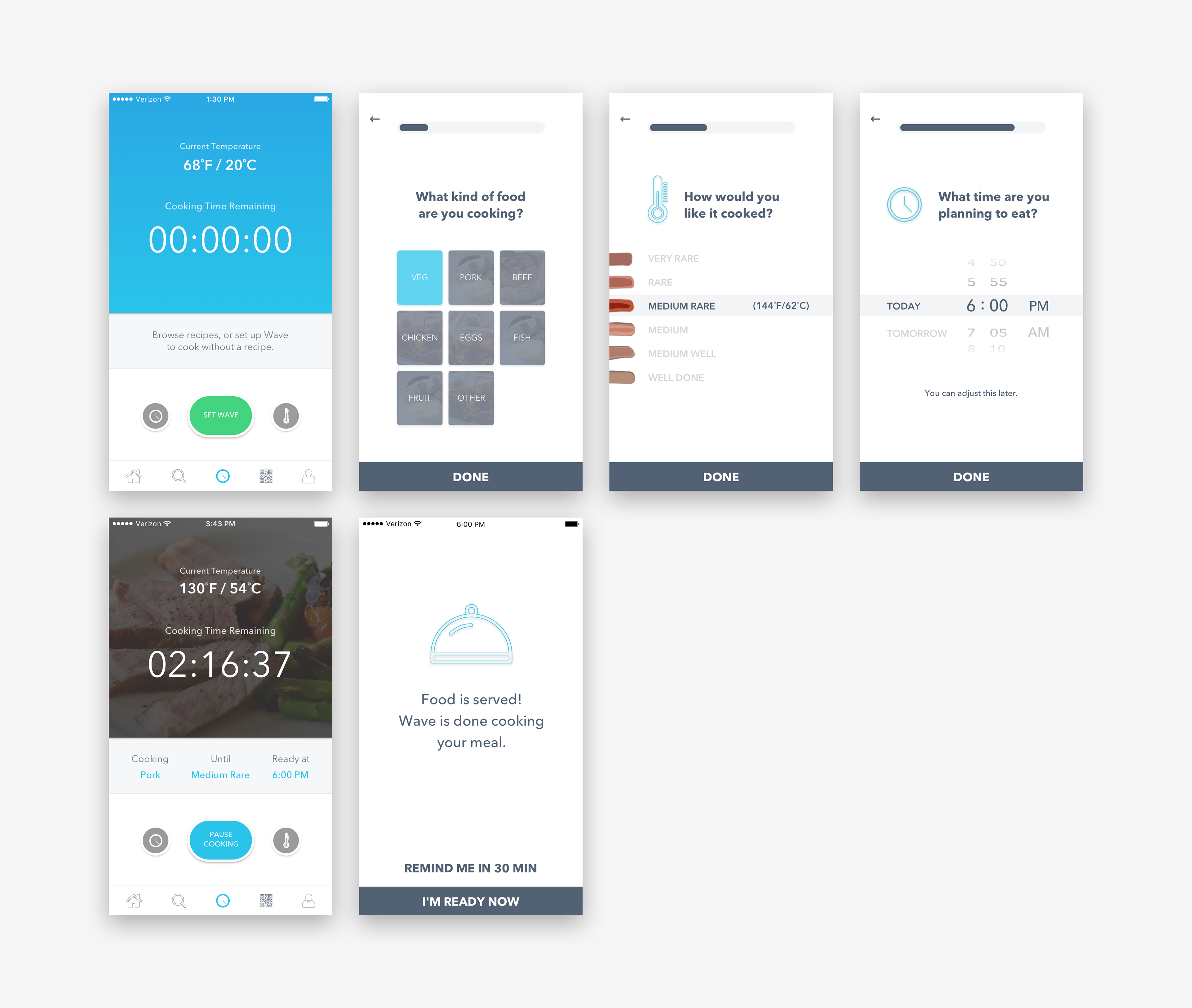
There needed to be several different ways to cook using the Wave, each requiring a slightly different design solution in terms of bridging the categories, options, and tasks a user would be thinking in with the data inputs the Wave needed to run.

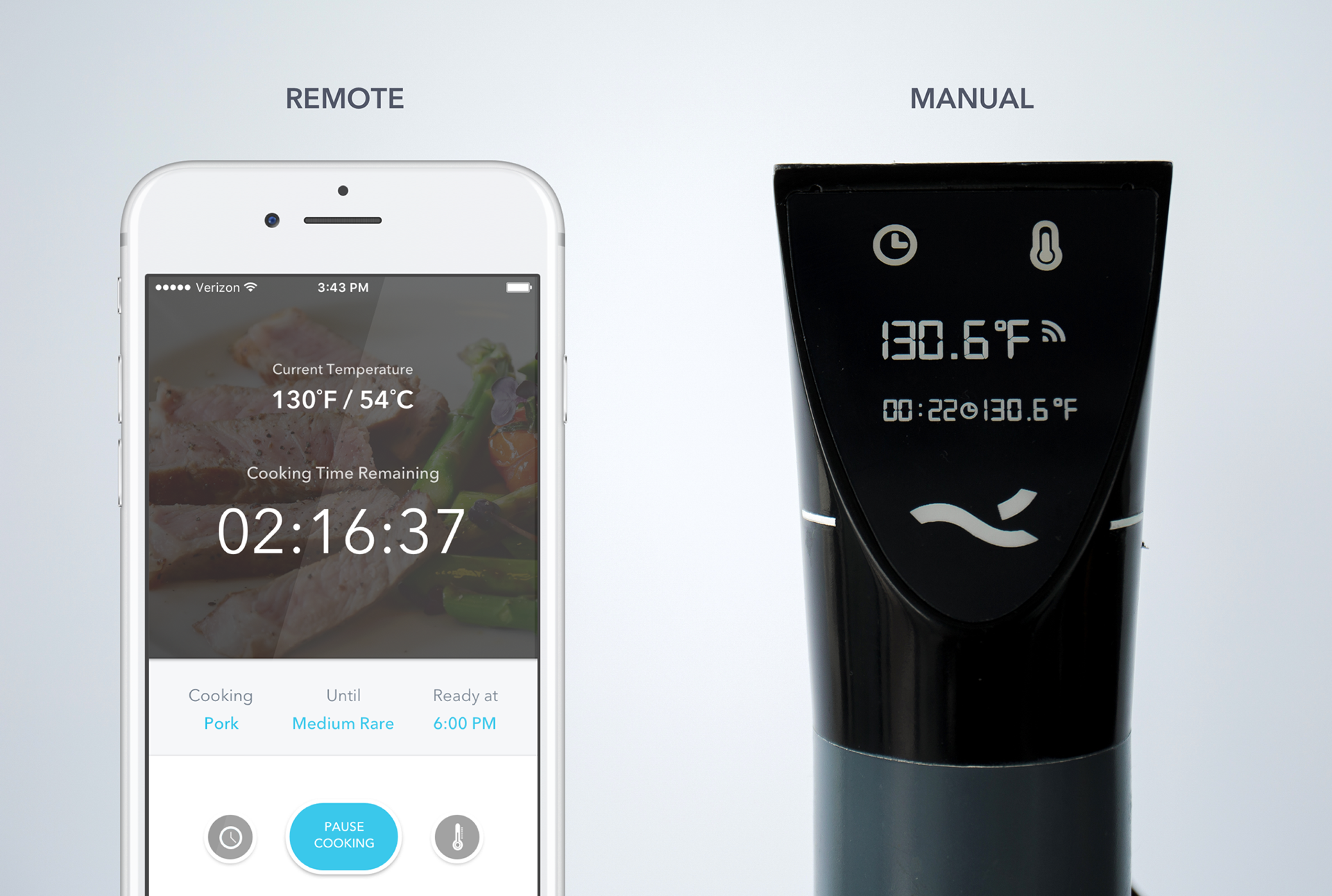
Direct Manual Control
The Wave needed to be completely usable through manual control alone, not using the app. When I came on board the hardware team had completed most of their work on design of the appliance itself, a functional prototype was almost up and running, and those of us working on the software were able to consider this preexisting design for the Wave as a fixed constraint to build the app in relation to.
I split the remaining situations involving cooking with the app into three core use cases, each designed as part of a different user journey.
App Manual Control
The main purpose of the app is to extend the functionality of the sous-vide circulator, and to enable users to control the circulator remotely. Though we expected most users to take advantage of the app's less technical cooking features, we knew it was important, especially to a contingent of power users, to be able to remotely access the full range of customizable manual control they can access when handling the circulator itself. (As I conducted research and developed an increasing sense of the user community, a recurring theme that informed my design decisions was users' desire for empowerment and control over the constructive process of cooking through a sense of personal ownership and mastery over cooking tools themselves).
App Guided Cooking Steps
This is the simplest, most accessible way of using the Wave to cook something when the user doesn't have a specific recipe in mind.

App Guided Cooking with Recipe
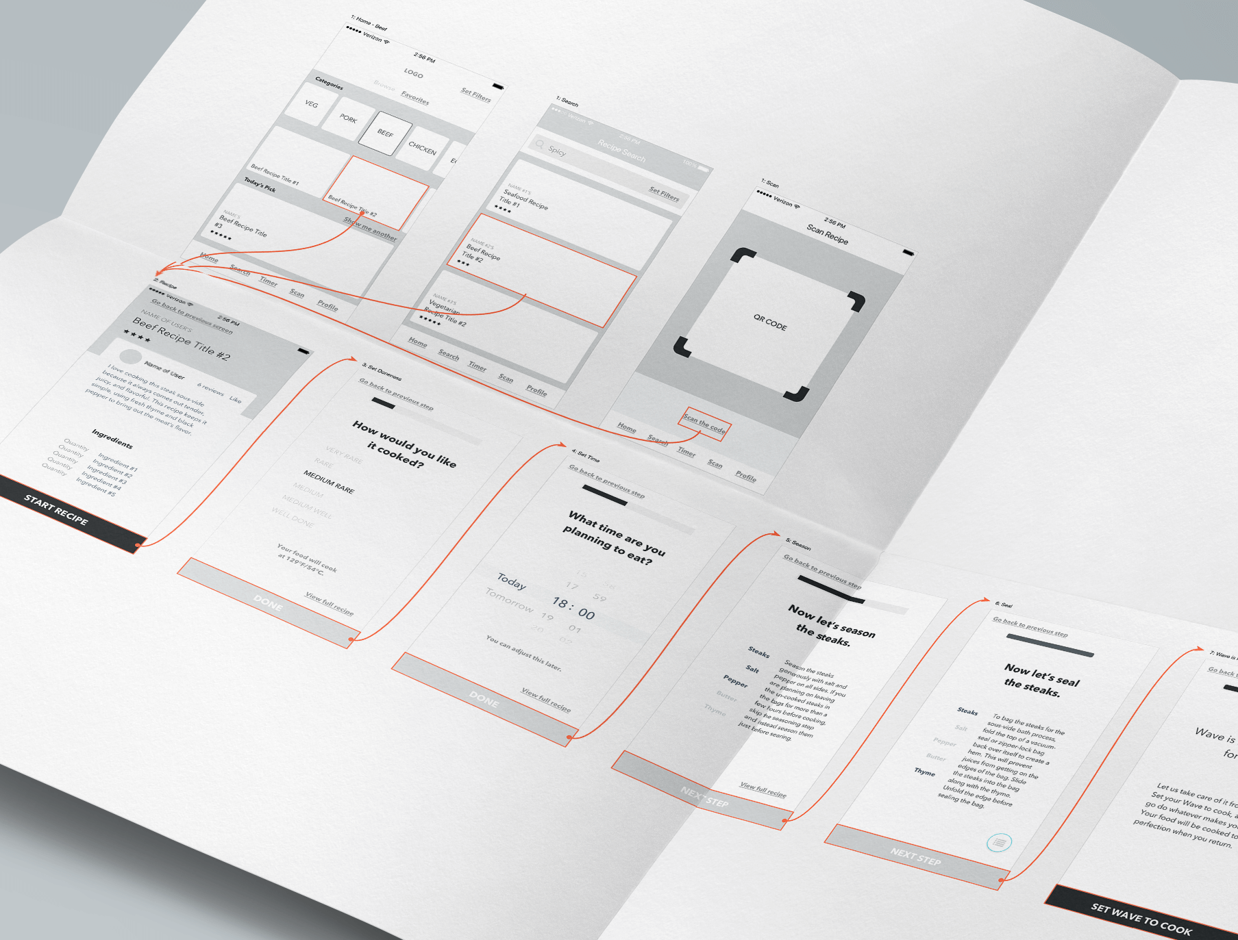
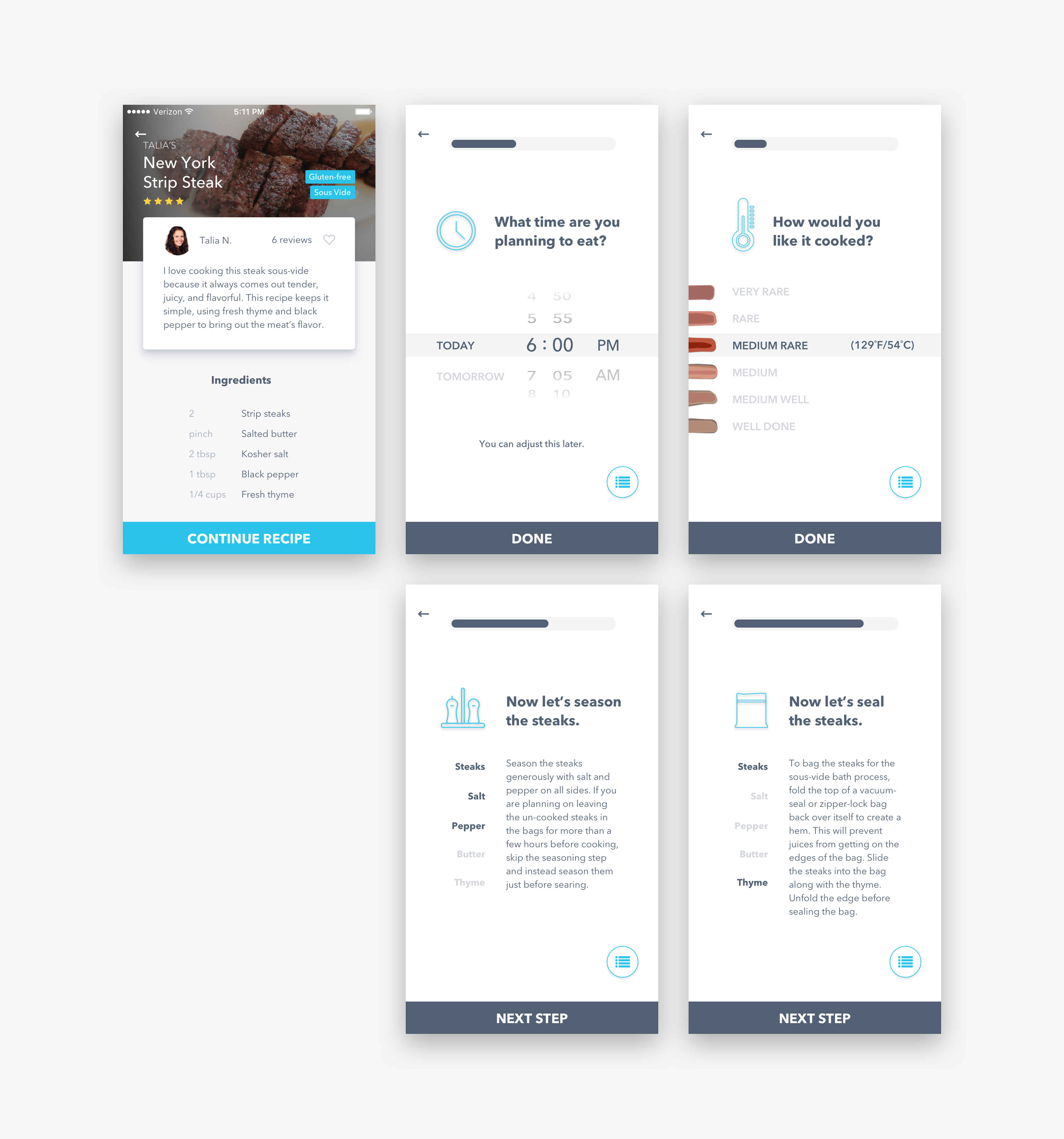
The below sections are about designing this user flow, a complex design problem involving integrating patterns and decisions from each of the other approaches, and balancing customizability with a streamlined process of clear, actionable steps.

The Recipe User Flow
In order to address the UX problem of following a recipe, I needed to accommodate a wide range of cooking experience levels.
Before being able to codify the process into distinct steps, I spoke to prospective users: both experienced home cooks comfortable with trying out new recipes and techniques, and those who were excited to try but relatively inexperienced with cooking. One of the things that came up again and again in the process of experienced home cooks is that they are thinking of the many things they do in terms of the function it has, rather than as a numbered step. They keep the broader context of what they are doing, in terms of its overall goal, in their mind as they complete each micro task in building a meal. So even though progressive disclosure is a powerful UX strategy in distilling complex processes into bite-sized, actionable pieces, this data from the field studies was an important reminder that we also needed to balance giving users enough context to feel oriented and to know why they are doing what they are doing.

Design Solutions for Recipe Usability
Descriptively Named Recipe Steps
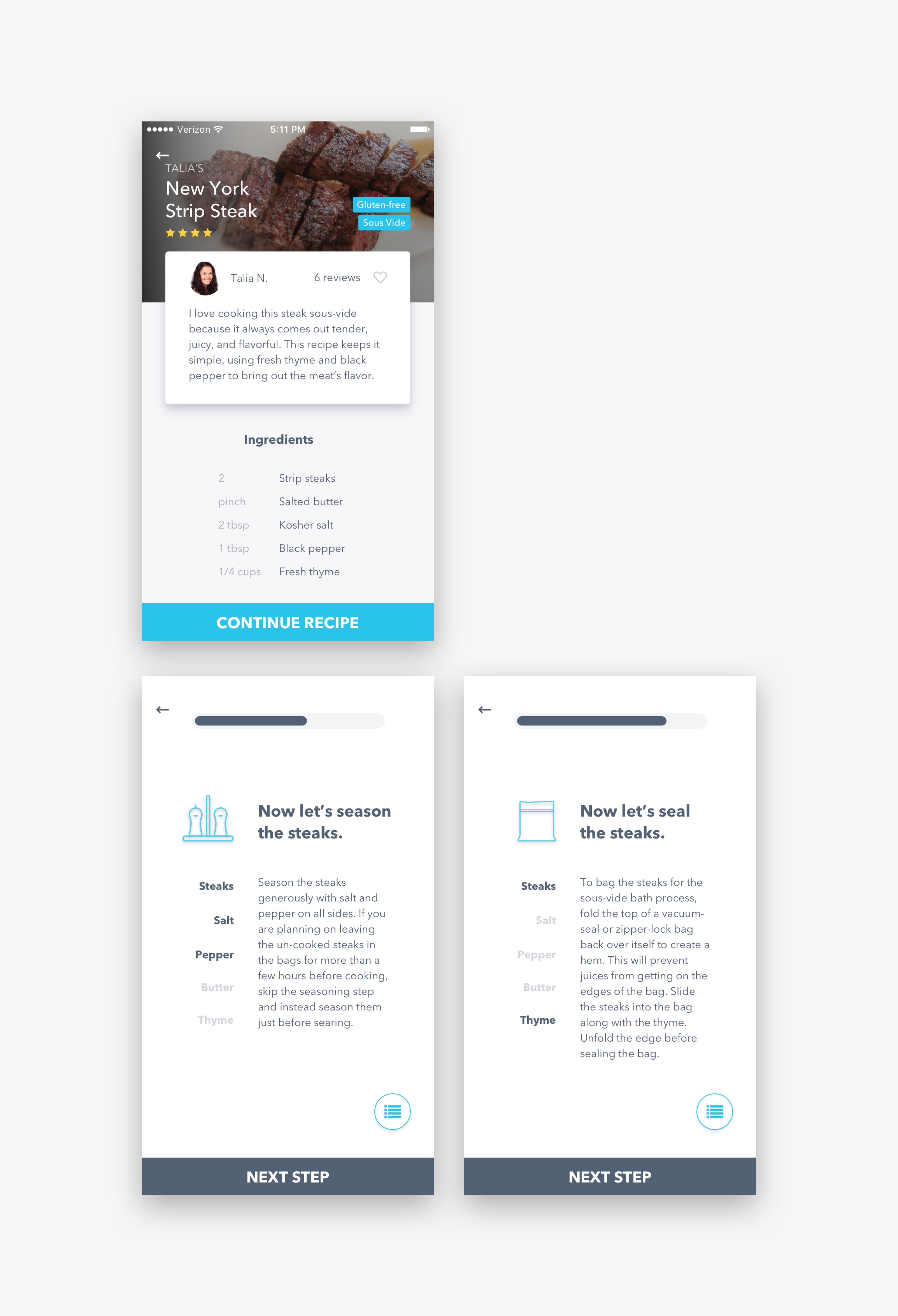
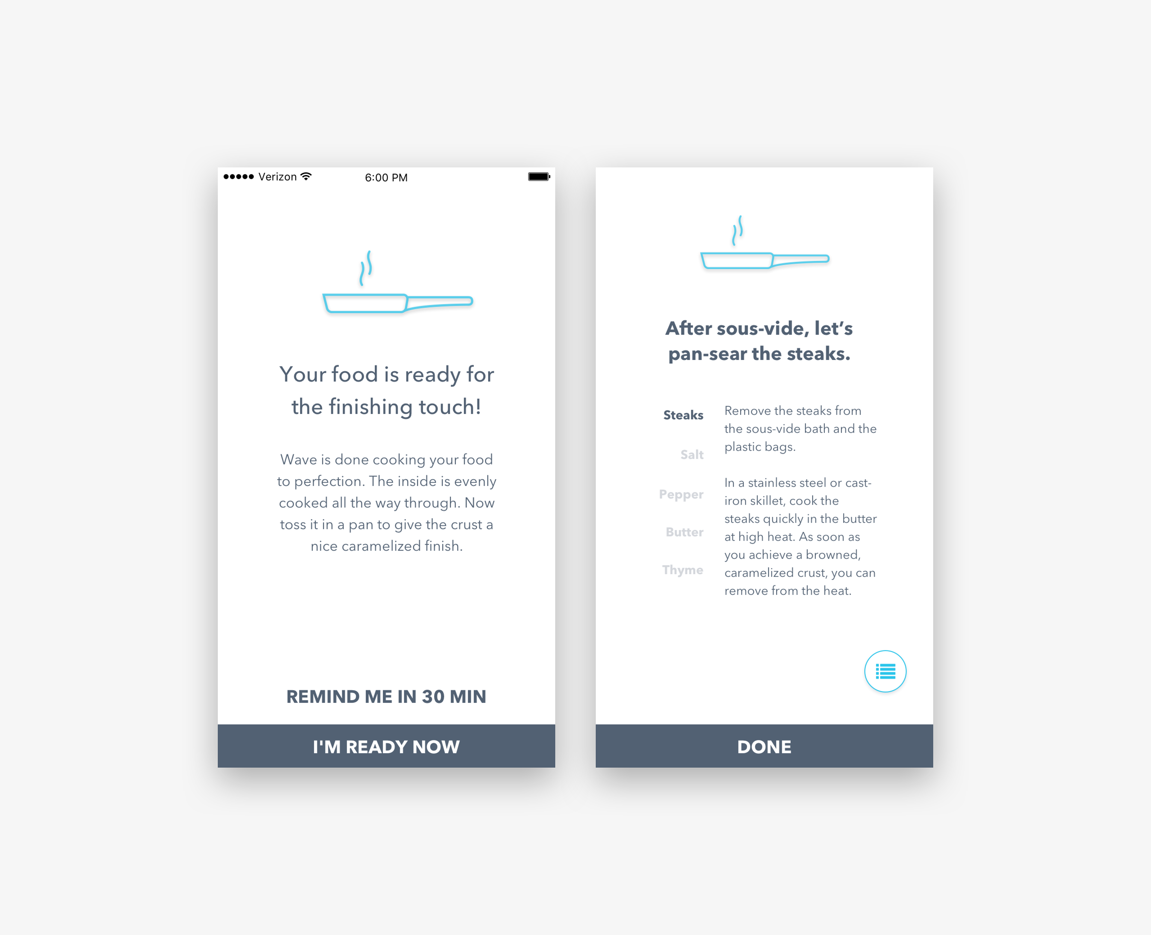
Named for their function, to connect all the little bits and pieces of what a user is doing to the whole of why they are doing it. This allows users to have greater ownership over their process, greater flexibility, and better ability to focus, particularly as they encounter unexpectedness in the real world of their kitchens and ingredients.
As we were creating fully realized, hi-fidelity product visualizations in part to communicate the product and its effectiveness to prospective sources of funding, this level of clarity had an additional perk: it communicates very clearly to third parties what the purpose of a given screen is and situates that specific interaction in the larger story of the product. Often (not always) highly usable solutions to complex problems for end users will have this effect.

List view and step view
Allowing users to toggle between an overall list view and a view of each step. Model design pattern: navigational directions One of the design patterns and use cases of directions I found most useful to draw from was driving/biking/walking/transit navigational directions.
Ingredients relevant to the step shown as active

Ingredients that don't pertain to the particular step (but do pertain to this "component" of the recipe) are shown for context but grayed out as inactive when not needed. I ended up deciding on this combination as a result of a home cooking field study and user testing with a early stage prototype.
Consistent, predictable, prominent main action button
The main action button can always be found in the same place on the bottom edge for simple navigation while hands are occupied. We expect the Step view to be more useful while cooking in part for the reason that scrolling actually requires more dexterity and decision making than tapping in this case.
Usable at slight distance/awkward angle from phone
I designed these recipe steps to be actionable, and big and bold so they could be easily referenced at a slightly awkward angle or a little bit of a distance from the phone, so a person in the middle of cooking could easily reorient.
