The Product
Impakt is a browser extension tool for Chrome that facilitates users' access to political and ethical information about companies as they browse products online.
My Role: UX & Visual Design
As the first product designer at Impakt, it was my responsibility to fully define and communicate the user experience of using the extension from the ground up, from early stage UX problem-solving and product/feature definition derived from the social mission, to developing the interaction model and implementing these solutions through a consistent, branded visual design language through the main purchasing task.


Problem Definition and Research
Stakeholder Research; Defining the Problem
As a team, we identified key goals and metrics in terms of business strategy, technical constraints, and social change goals. My job was to develop a thorough understanding of the product in terms of users. I was in charge of designing an interaction model, visual UI, and design system for the MVP for product communication and to lay a groundwork that future design decisions could be built on.
Competitive Research/Contextual UI Patterns
Throughout my process, I consulted existing reference patterns:
- to understand how similar problems have been solved well
- to strategically situate the product in relation to potential competitors, to focus on distinguishing characteristics and on pioneering yet unsolved/uncharted areas of a problem (in this case we looked at some of the failures and successes of other ethical shopping resources and tools, and other extensions that aim to influence users' search and shopping behavior)
- to develop an awareness of UI patterns and environments familiar to users in their immediate context while using the product and also in their lives more generally (Amazon, Wayfair, Jet, Chrome)
Consulting Secondary Literature
I reached out to researchers who had studied consumer pre-purchase information search, as well as those who had studied factors driving ethical consumption, to request the full text of their articles. I created a shared folder for the team to use these articles as a shared reference, and to be able to discuss this reference information to design questions for our user interviews, and to make preliminary design decisions.
Developing Hypotheses and Questions for User Research
I developed questions for an upcoming discovery research session with prospective users, to understand more about the basis for recent purchase decisions, how they use Amazon.com, and how they actively or passively seek information about the companies responsible for the products they buy.
Design Synthesis
Synthesizing Personas/Task Analysis
Once we had established Amazon.com as the primary use environment, I consulted secondary literature and the recorded interviews. From this, I recorded a video walkthrough of a user persona's online pre-purchase information search behavior. I showed this to the team and led them in a brainstorming discussion to get everyone grounded in the specifics of the UI environment and the main user task.
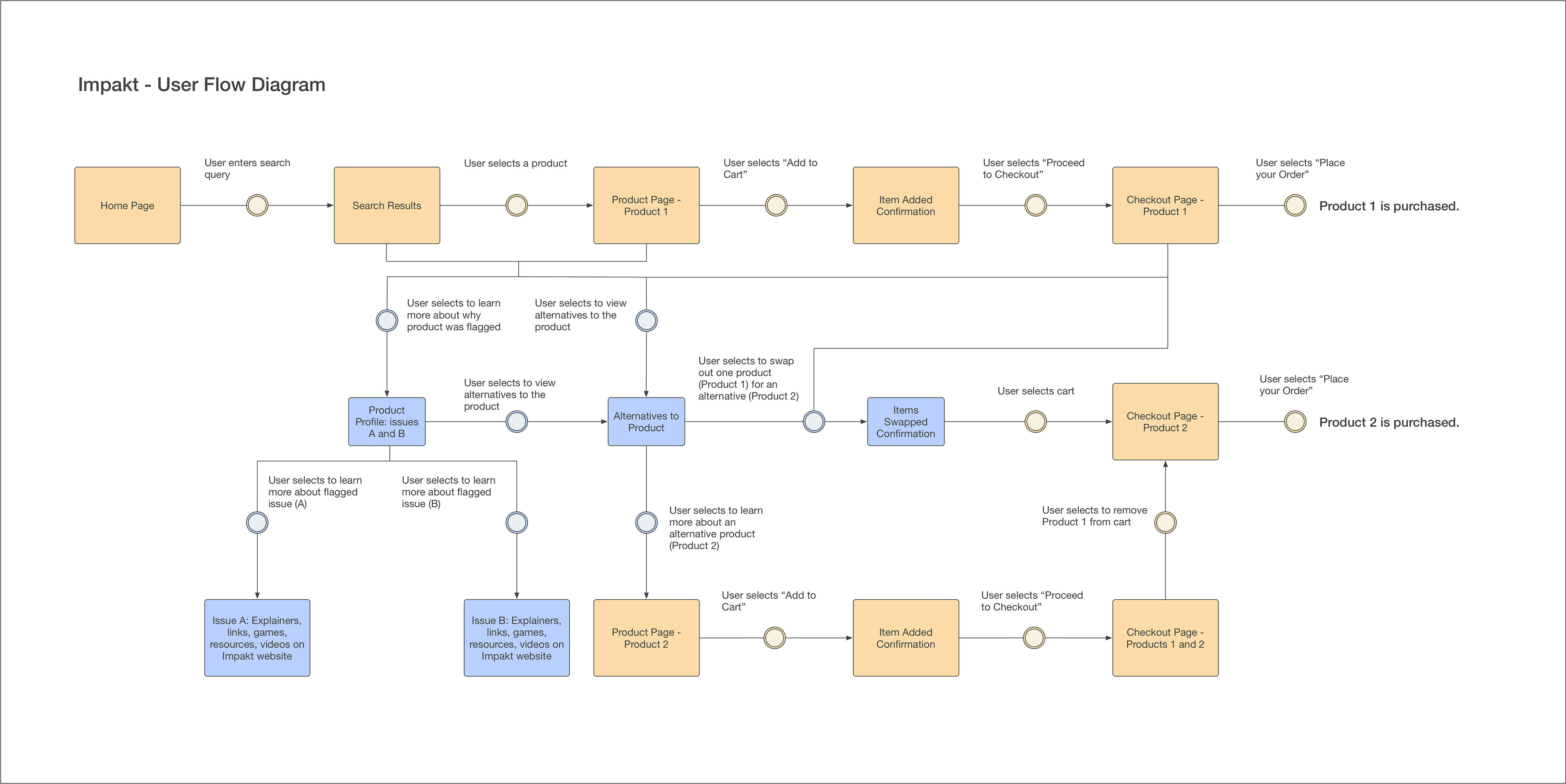
Diagramming User Flow
I mapped out the user’s touchpoints with the system in the main task environment, to help clarify and keep track of the internal model we were using. Here’s the flow diagram I created to describe how an Amazon purchase process could work with the Impakt browser extension.

Making Design Decisions
Sketching UI Interactions
I sketch to brainstorm, to communicate with myself and think aloud on paper, to communicate with the team and other stakeholders. At this stage, the sketches are of user interface states, components, patterns: ways the UI can actually communicate to users. At this stage, if a sketch is working well, I may mock up a higher fidelity version to help visualize and discuss the direction with others. Depending on the situation, lower or higher fidelity versions may be better at stimulating the kind of discussion I’m seeking. As a general rule, I tend to find higher fidelity versions better for persuading/onboarding stakeholders, and lower fidelity versions better if I’m mainly looking to ask questions and solicit input to inform future decisions. With this team, we had a great collaborative relationship did a lot of work in person to contribute cross-functional perspectives to brainstorm together.
Creating a Consistent Visual Language Across the Product
When I design the way a product’s UI communicates to its users, part of what I am doing is designing a voice, an entity, an institution, a personality: a brand. And there is an underlying system to what makes that design language feel branded, unified, and consistent while maintaining the flexibility to afford different kinds of interactions, communicate different kinds of information (as well as distinct units of the same kind of information), and adapt subtly to confirm the effect a user's action has had or to show that the user has progressed in a task.
Sometimes I work from an existing brand book or style guide, and occasionally I have worked with a specialized marketing designer to create a design vocabulary that can be applied consistently across both product UI and marketing materials. With early stage startups, I am often responsible for creating a new design vocabulary for both the product and company myself, including the visual identity of the brand, applying the branded feel and distinctive voice across all forms of communication. For Impakt, this included developing a foundational visual identity, a logo, for the MVP, and using the arrow-based graphic as a starting point for the visual system across the product UI.


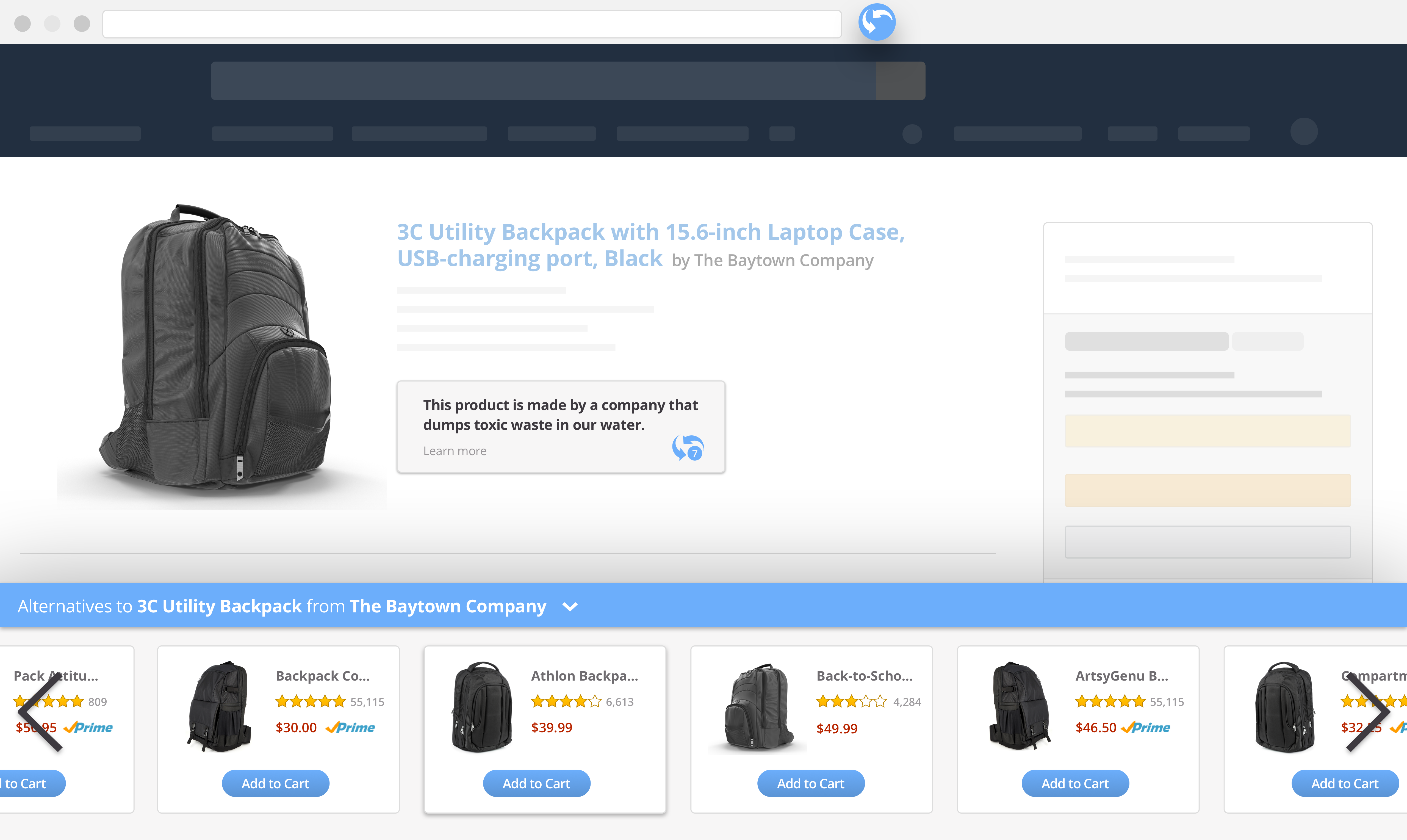
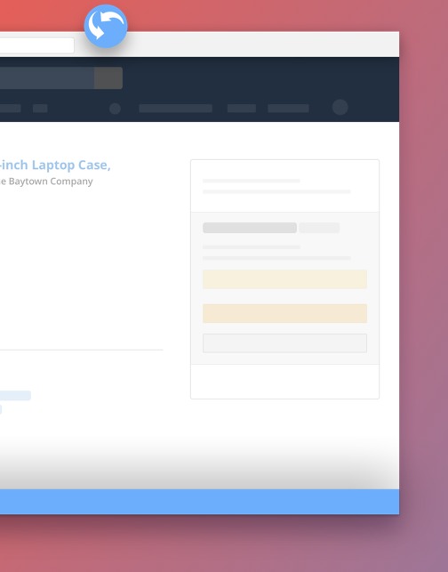
Because Impakt is a browser extension, it would primarily be experienced by users in the form of individual components appearing on top of another website's UI. This was a major and particularly interesting consideration in designing its visual language. I focused on the main use case of someone making a purchase on Amazon.com and considered Amazon's UI (grid system, typography, button styles, notifications, etc.) as the primary visual context in which users would be encountering the components of the experience I was designing. This and the fixed nature of the platform – users would have to access the extension through the Chrome browser on desktop – allowed me to design a web experience tailored to a focused, specific context, more the way I typically would with a native app than a website. I found it helpful to draw from my experiences as a designer and user of both.

The Amazon context provided a challenge, as their UI happens to be dense in very diverse content, highly cluttered, and full of inconsistent styling. I designed each component to draw enough focus needed to stand out, maintaining association by visual similarity with other Impakt components and differentiating itself from the Amazon UI, while also not disrupting the usual browsing experience so much that users would disable it. This will be an important balance to tweak in future iterations with insights from analytics about trends in user behavior when using the extension.

